Template Gallery
40 websites.
Built for your trade.
Every template is tuned to your industry — brand-matched, content-ready, and live in under 24 hours.
40
Templates
4
Industries
<24h
Go-live time
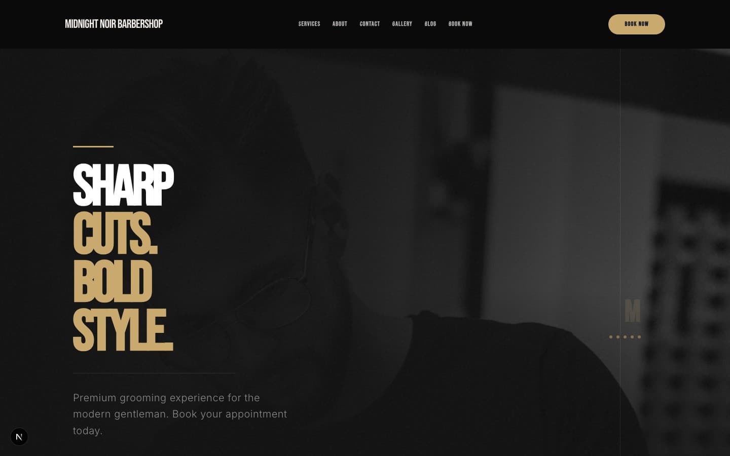
Midnight Noir
Dark luxury barbershop with cinematic full-bleed hero, gold accent system, noir photography treatment, and premium negative space. Best for established shops positioning as premium/luxury.
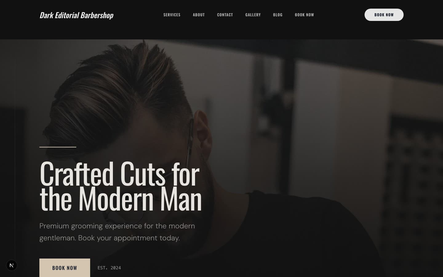
Dark Editorial
Magazine-inspired dark layout with editorial typography, overlapping image panels, asymmetric grids, and art-directed photography. Sophisticated, narrative-driven, visually layered.
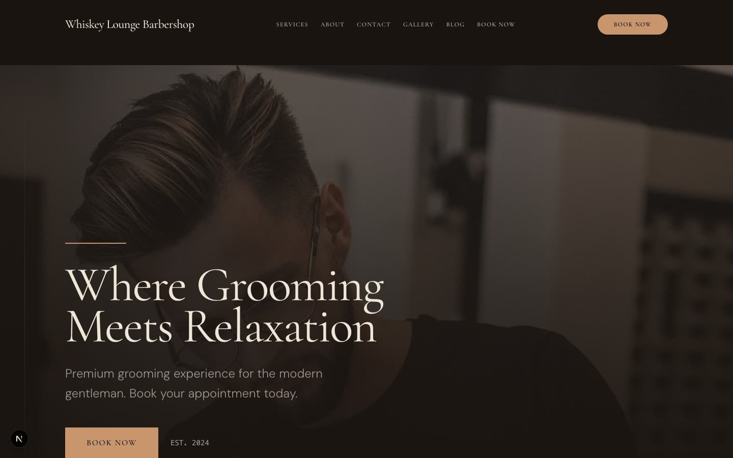
Whiskey Lounge
Dark warm amber/bourbon palette with intimate lighting feel, leather texture influences, and speakeasy atmosphere. Warm, inviting, masculine without being aggressive.
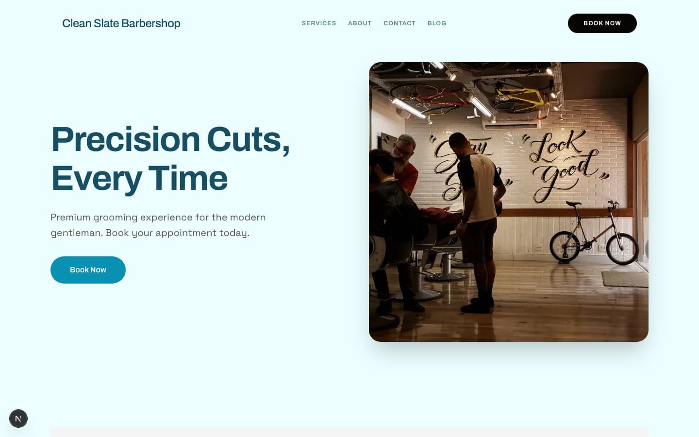
Clean Slate
Fresh, energetic single-column layout with vibrant cyan+green palette, geometric shape overlays, and bold block-based design. Mobile-first conversion focus with large type lockups (32px+). High contrast, modern, and youthful.
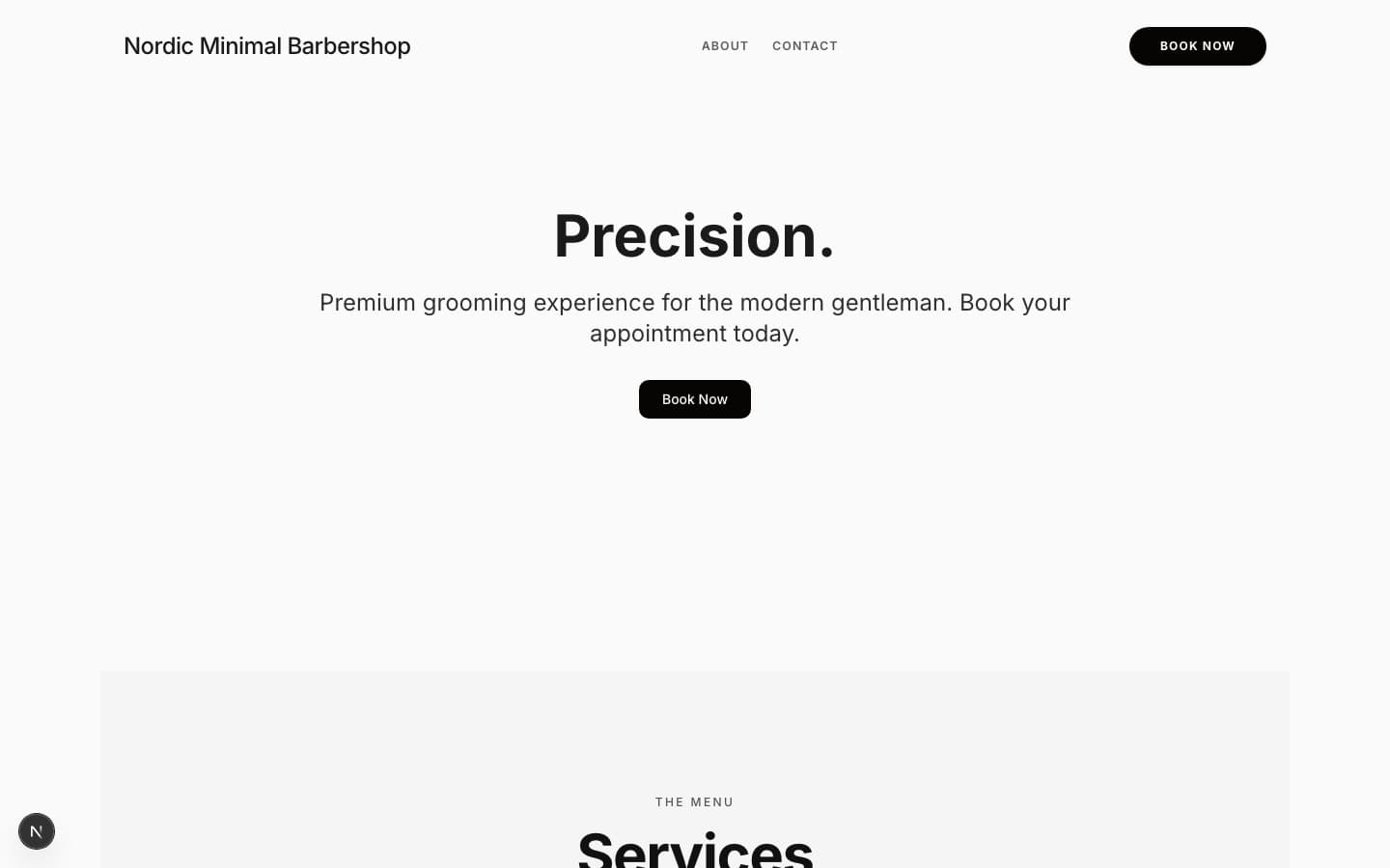
Nordic Minimal
Cool grey/blue palette with maximum white space, quiet sans-serif typography, and Scandinavian restraint. Less is more. Every pixel earns its place.
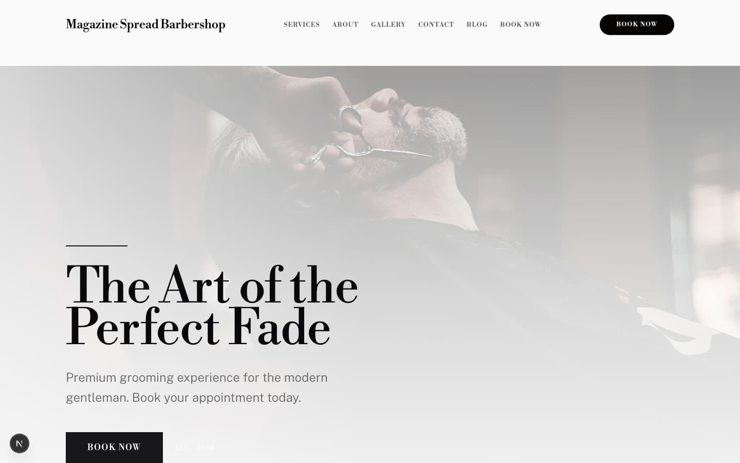
Magazine Spread
Swiss Modernism 2.0: 12-column modular grid system with mathematical spacing, editorial black+pink palette, and scroll-triggered storytelling. Inspired by International Typographic Style. WCAG AAA compliant. Photography-first with chapter-based narrative structure.
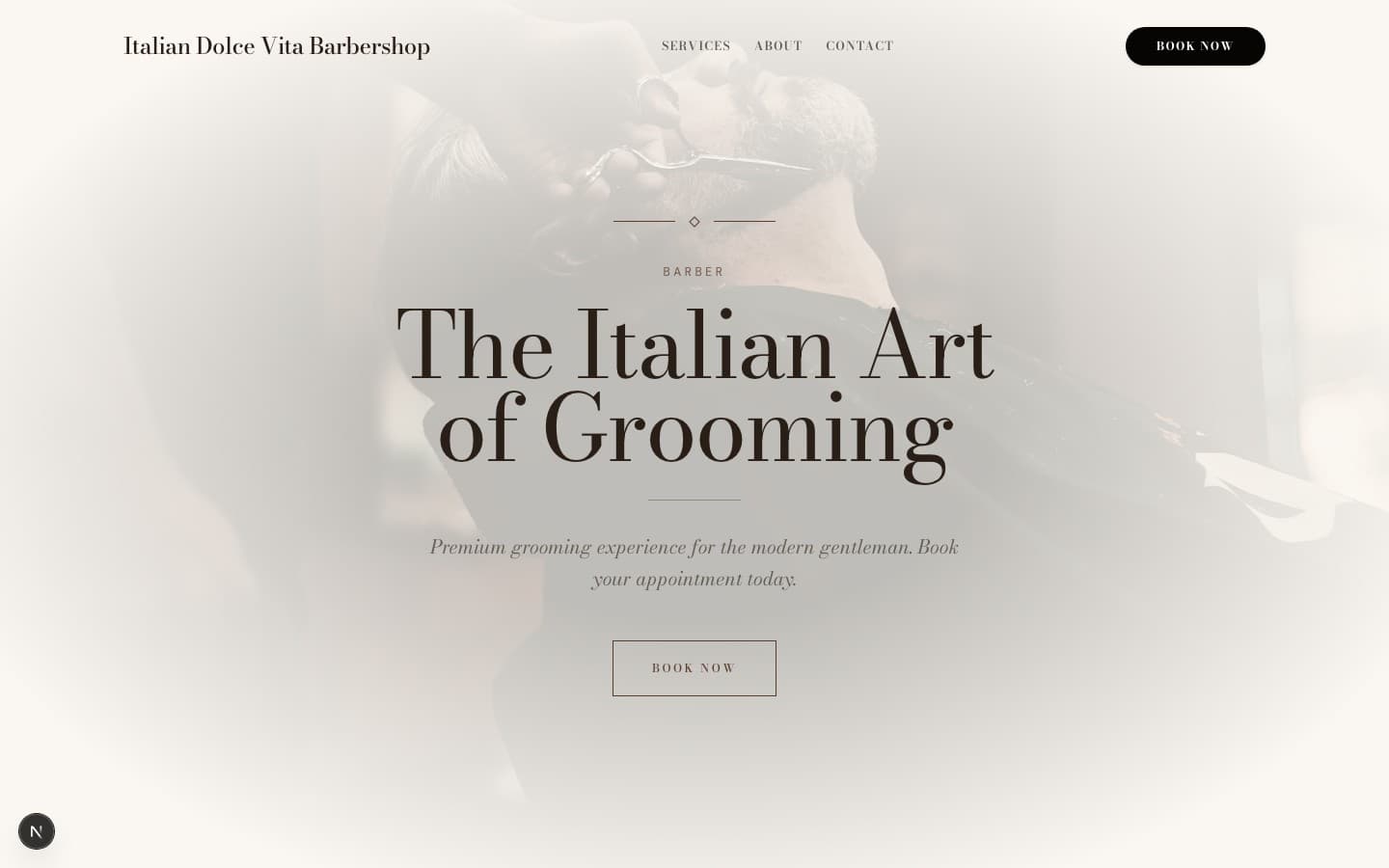
Italian Dolce Vita
Vintage Italian romance — la dolce vita typography, Mediterranean warmth, lifestyle photography, and old-world European charm. Espresso tones, marble textures, Roman elegance.
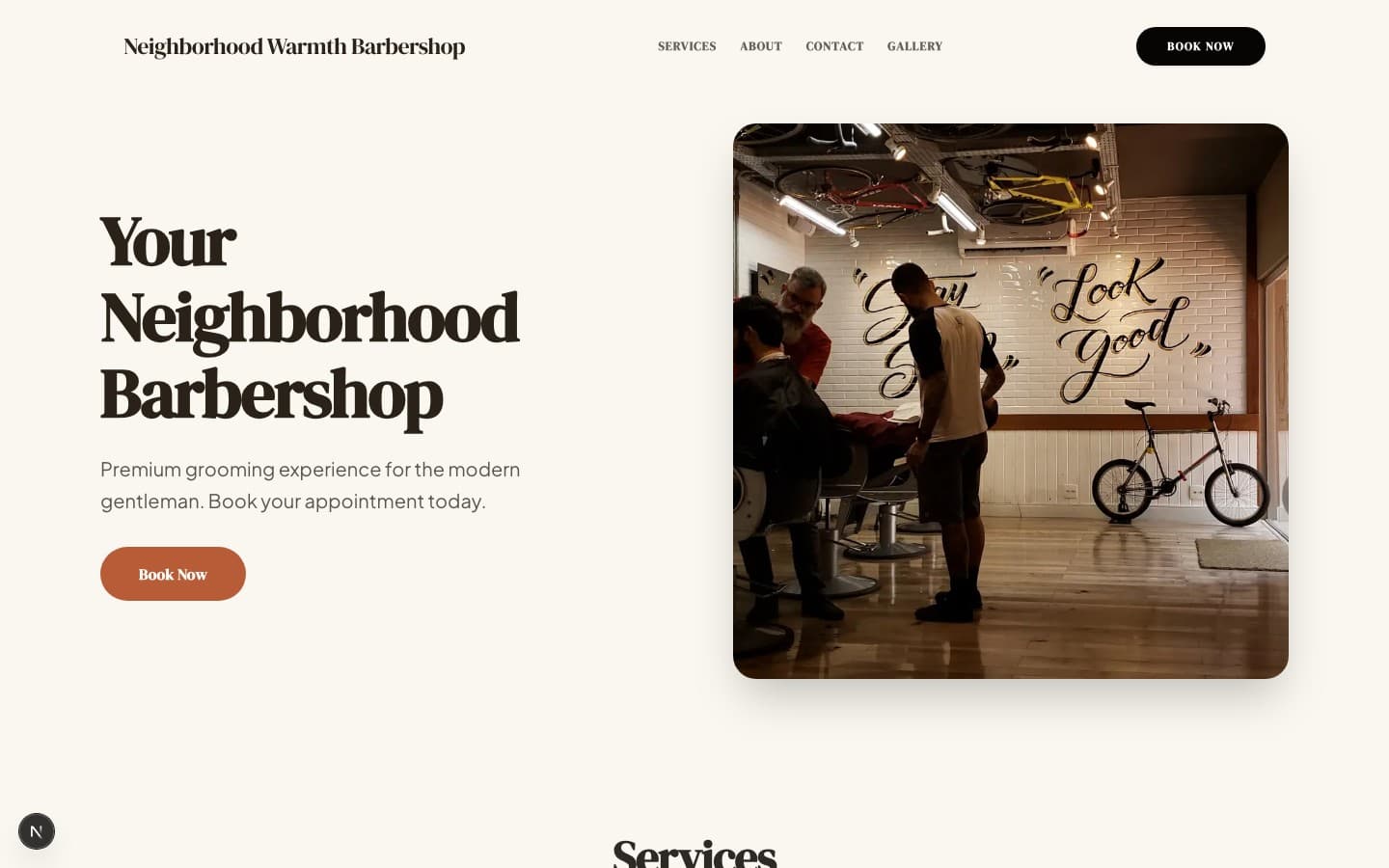
Neighborhood Warmth
Friendly earth tones, authentic photography, warm community vibe. The shop is part of the neighborhood — everyone knows your name. Welcoming, unpretentious, real.
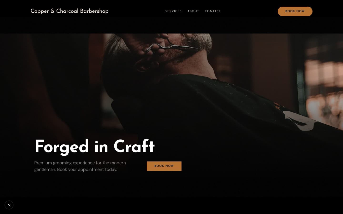
Copper & Charcoal
Dark warmth with copper/bronze metallic accents and aged metal feel. Like a barbershop built in an old copper foundry. Industrial warmth — textured, tactile, substantial.
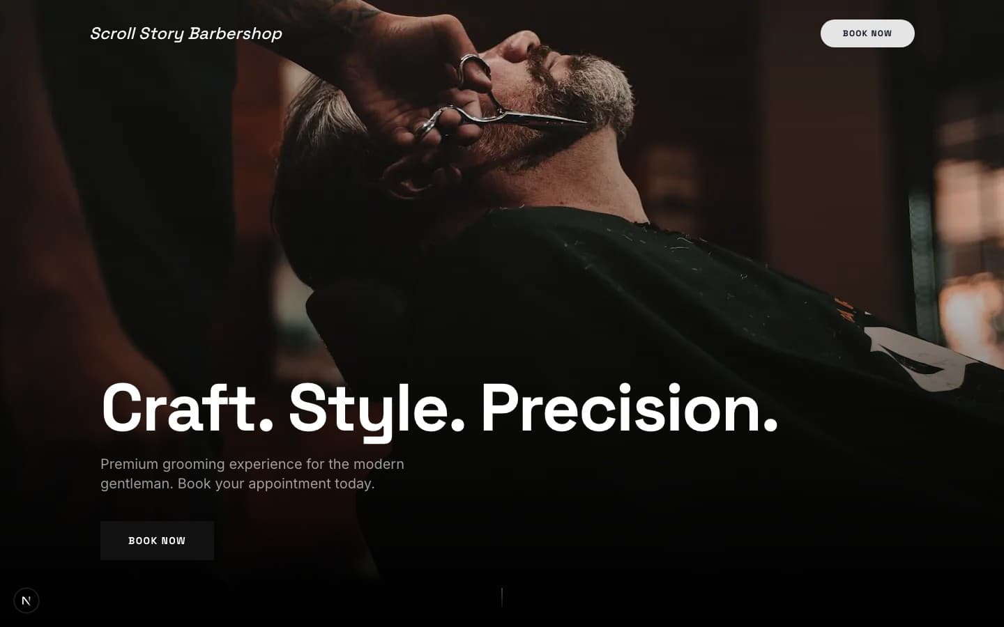
Scroll Story
Single-page narrative experience with section-by-section cinematic reveals. No traditional page navigation — the entire site is one continuous scroll story with full-viewport sections.

Lounge Classic
Warm premium single-page layout with serif headings, cream/white backgrounds, gold accent system, and rich content density. Everything on one scroll — services, reviews, gallery, location. Best for established lounge-style shops with real reviews and photos.
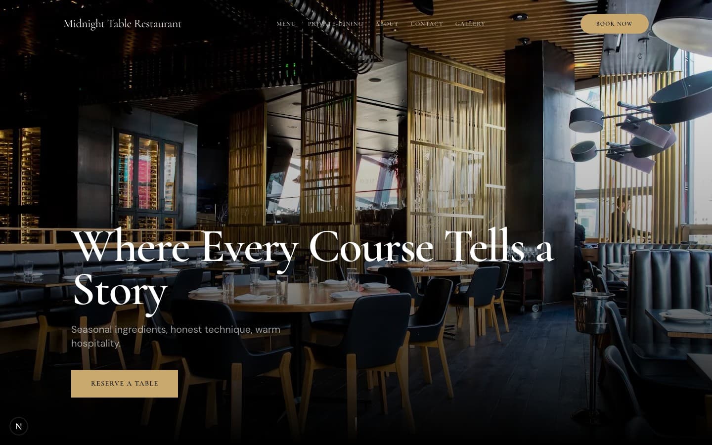
Midnight Table
Candlelit fine dining with a 7-course tasting menu, private dining rooms, and sommelier-led beverage pairings. Gold accents on deep black, italic serif typography, cinematic food photography with shallow depth of field.
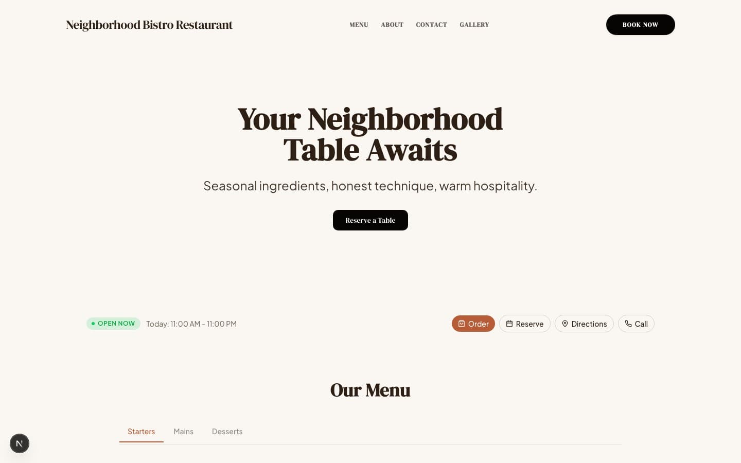
Neighborhood Bistro
Your favorite neighborhood spot — the one where the host knows your name and the brunch line is worth it. Brick-red accents on warm cream, friendly serif headings, Google-review wall, and a quick-action bar for reserve/order/call.
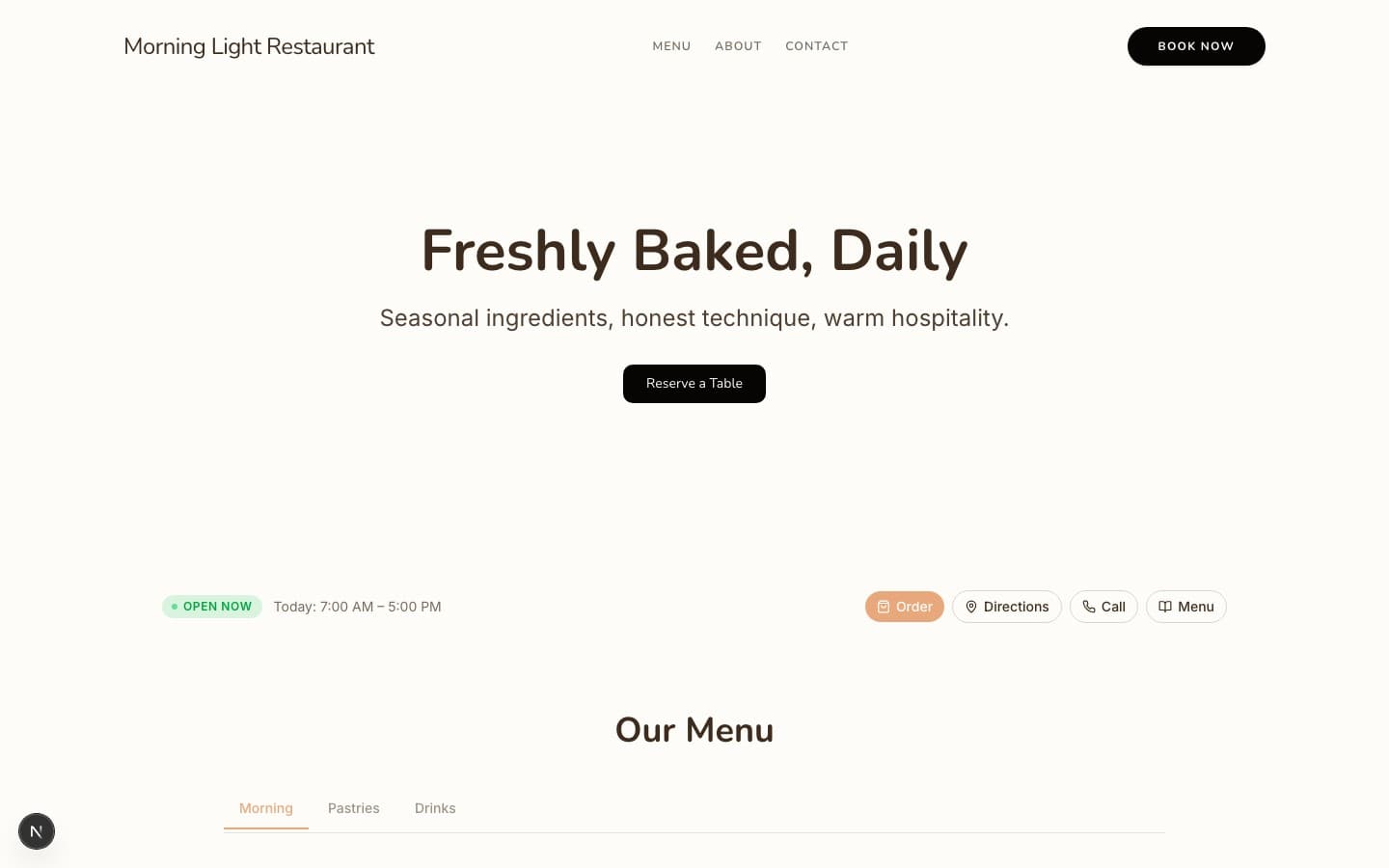
Morning Light
Sunny cafe and bakery where the sourdough is still warm and the latte art is worth photographing. Peach accents on white, rounded Nunito typography, bright overhead food photography, and mobile-first order-ahead actions.
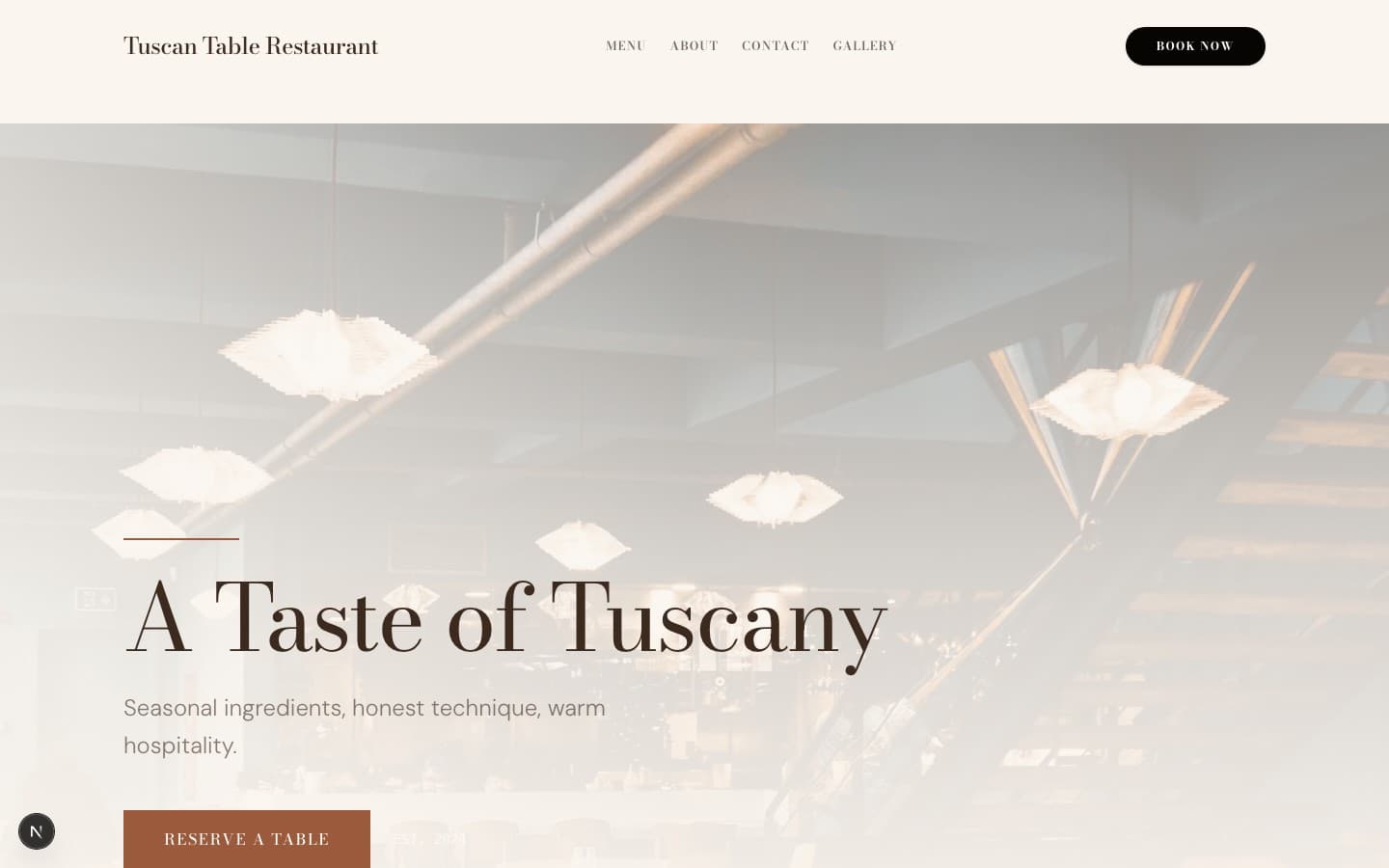
Tuscan Table
Old-world Italian trattoria where nonna's recipes meet a serious Tuscan wine list. Sienna and olive accents on warm cream, Bodoni italic headlines, magazine-style dish features, and a wine-cellar beverage program with atmospheric dining zones.
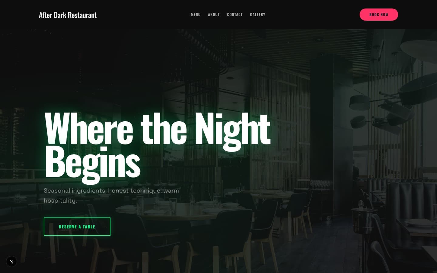
After Dark
Hidden speakeasy with craft cocktails, a DJ booth, and neon-pink glow on everything. Drinks-first layout, Oswald condensed all-caps headlines, moody shallow-DOF photography, and a social-proof wall from the late-night crowd.
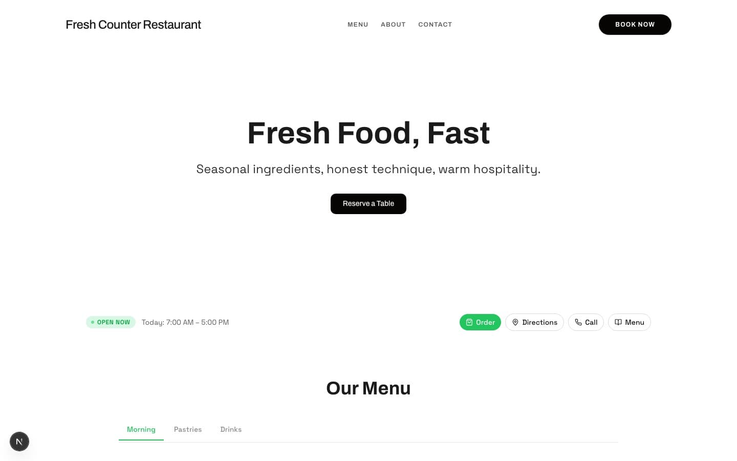
Fresh Counter
Fast-casual bowl bar where the ordering flow is as clean as the ingredients. Vibrant green on white, bold Archivo geometric type, overhead flat-lay food shots, and a conversion-focused layout with order-online as the primary CTA.
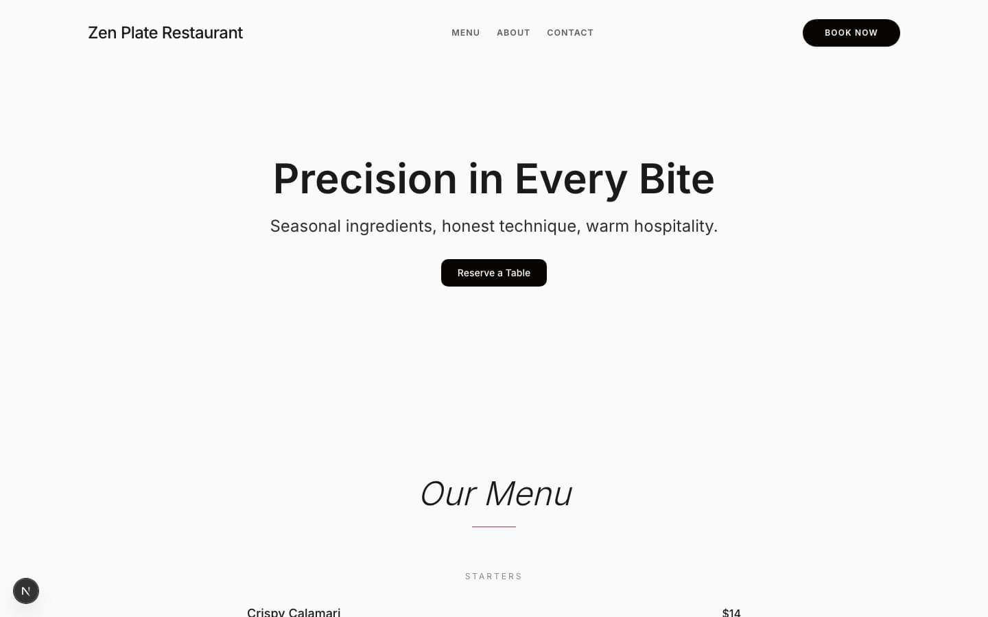
Zen Plate
Omakase counter experience with sake pairings and a chef who speaks through the fish. Single Japanese-red accent on near-white, ultralight Inter typography, radical negative space, and an ingredient-breakdown spotlight that treats each dish like art.
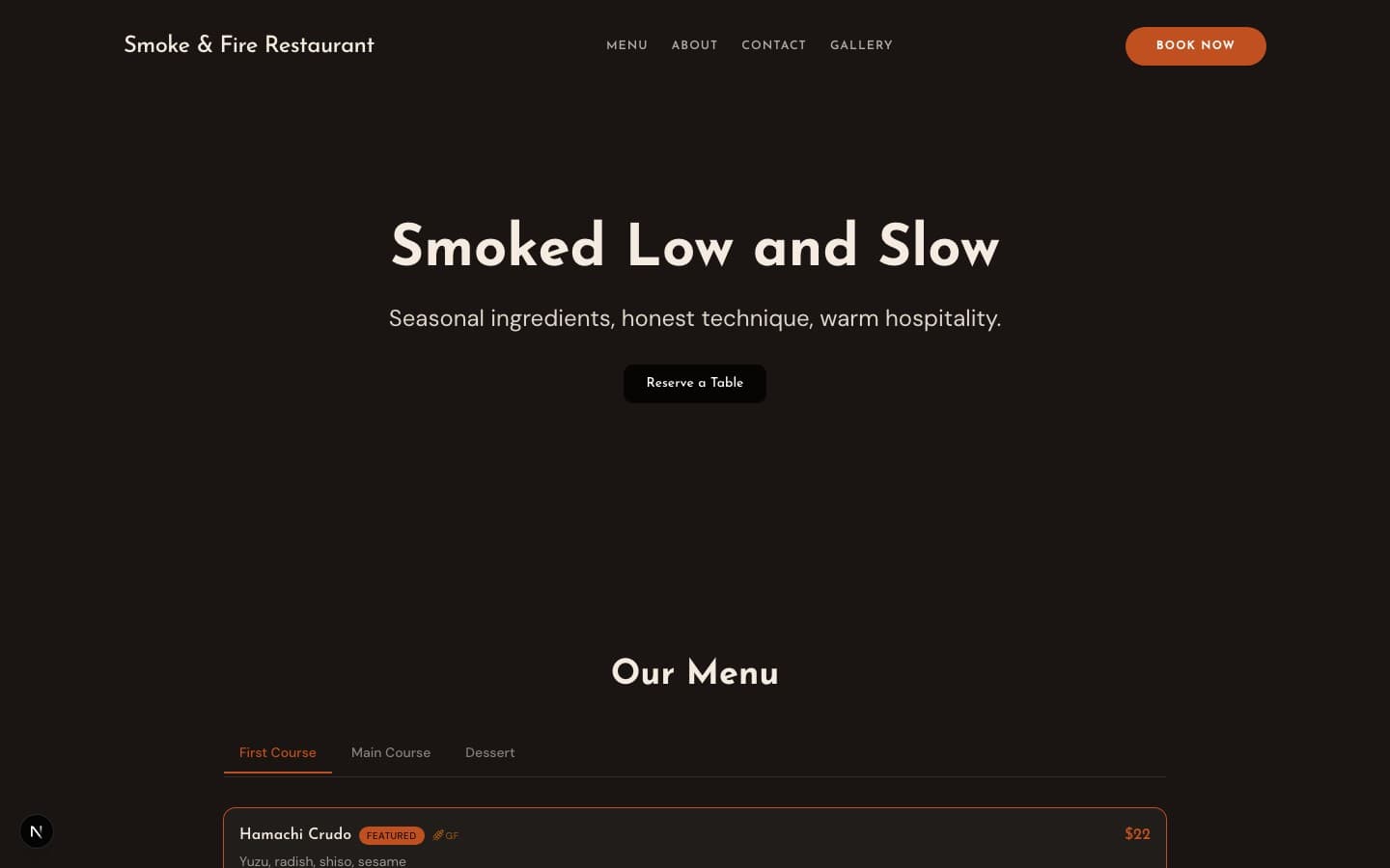
Smoke & Fire
Post-oak BBQ joint with a craft beer bar and a pit room you can smell from the parking lot. Ember-orange on charcoal, bold Josefin Sans condensed type, high-contrast smoke-and-fire photography, and a taps-first beverage section.
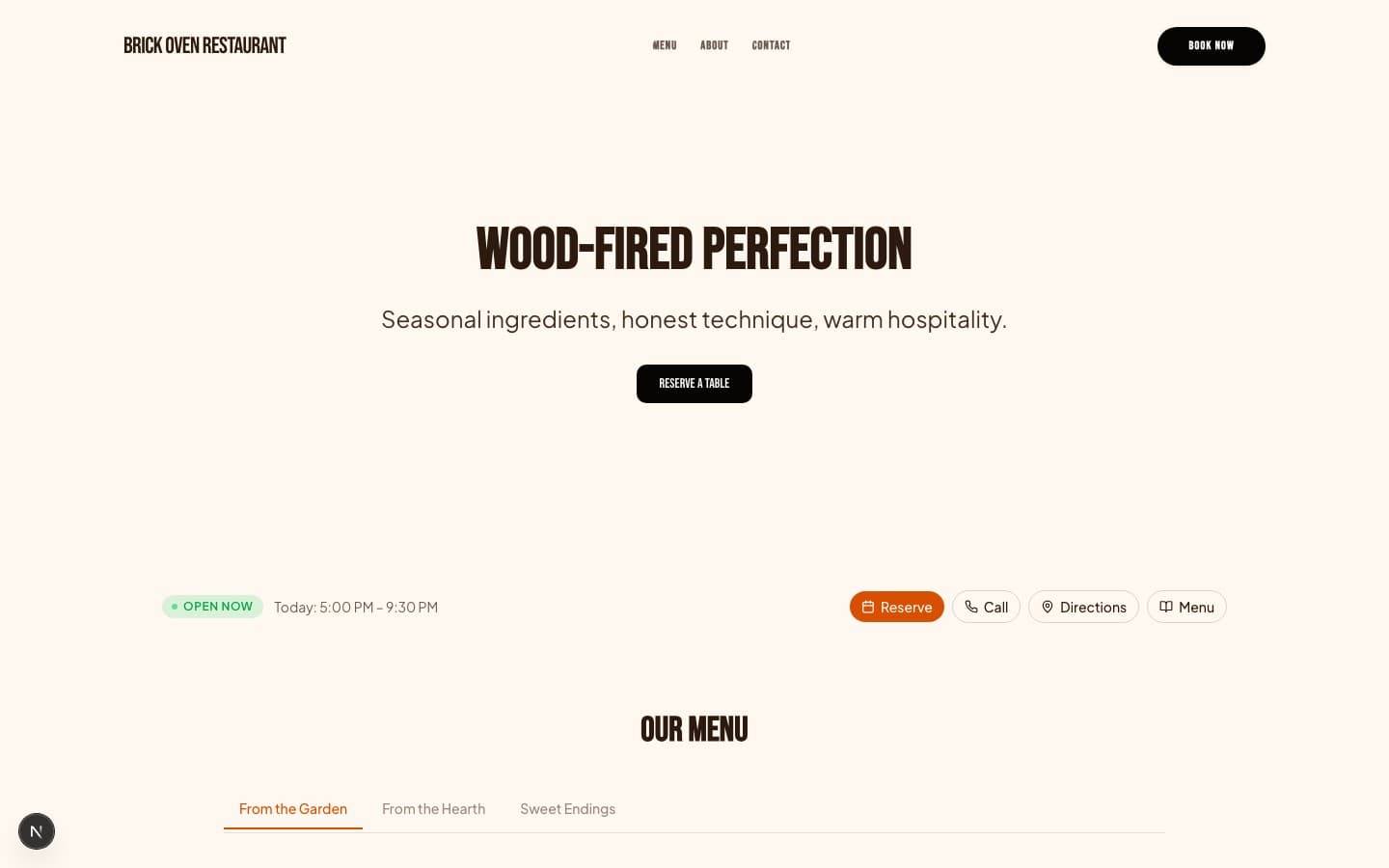
Brick Oven
Neighborhood pizzeria with a blazing brick oven, hand-stretched dough, and a line out the door on Friday nights. Bold orange on warm cream, Bebas Neue all-caps headlines, close-up melting-cheese photography, and an order-ahead mobile-first layout.
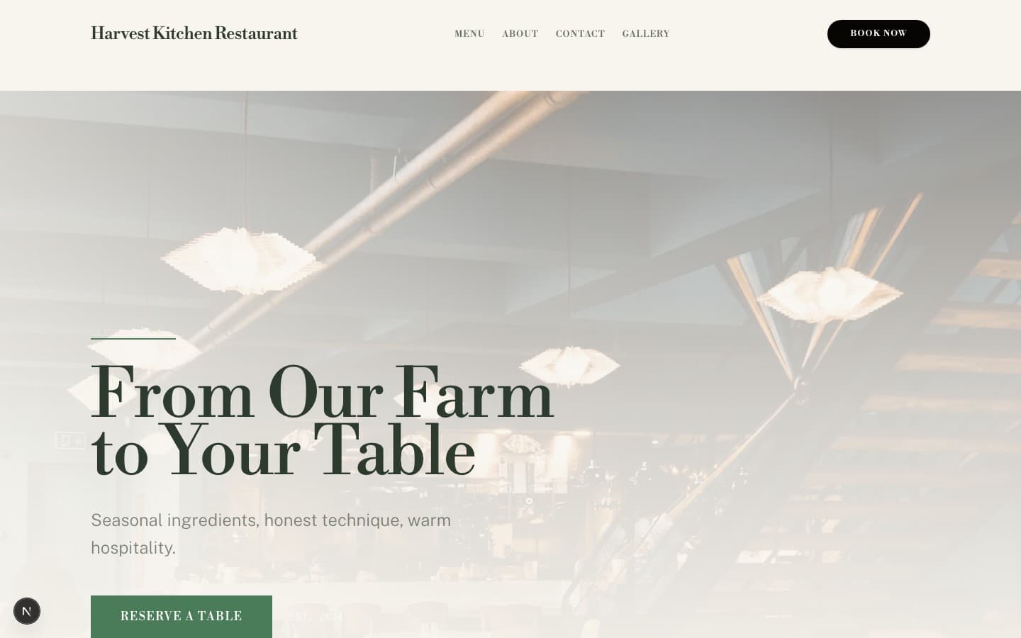
Harvest Kitchen
American seasonal farm-to-table with a kitchen garden, CSA partnership, and a menu that changes with what the land grows. Deep forest green on warm linen, Libre Bodoni italic headlines, natural-light photography of gardens and plated produce, and an ingredient-breakdown spotlight that traces each dish to its farm.
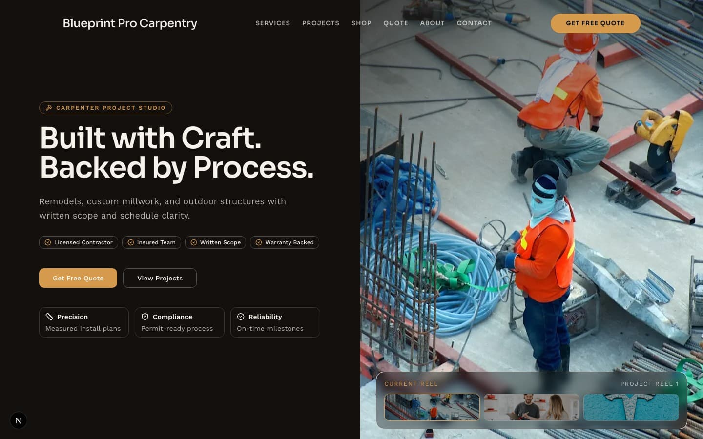
Blueprint Pro
Blueprint overlays, high-contrast trust surfaces, and an estimate-first conversion flow for remodel-driven demand.
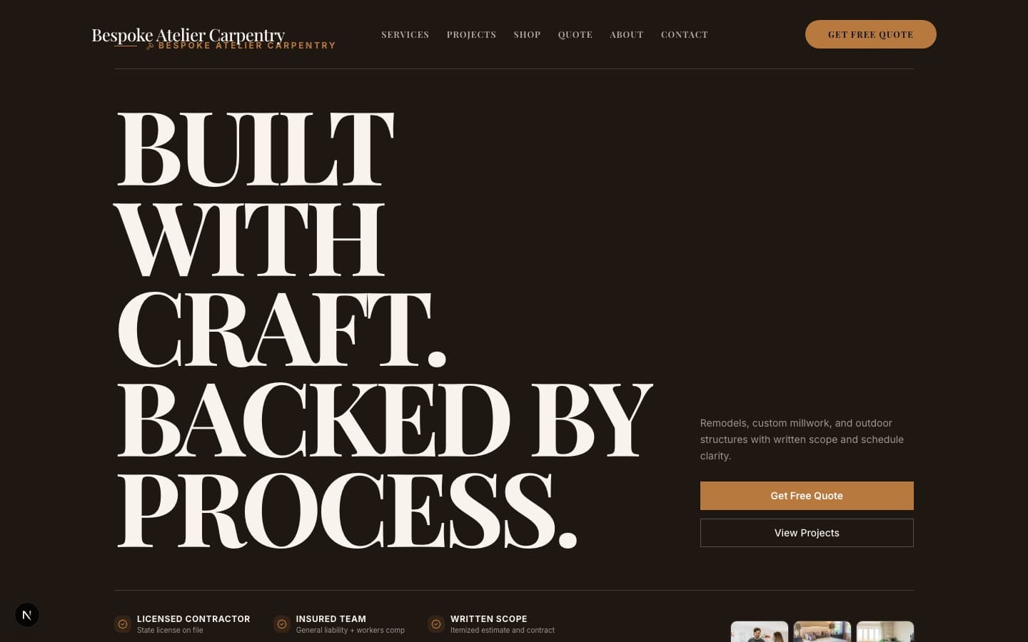
Bespoke Atelier
Editorial luxury woodgrain aesthetic with detailed craftsmanship storytelling and quote-cart commerce intent.
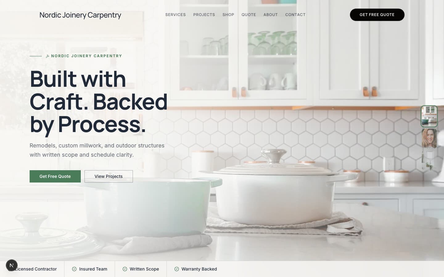
Nordic Joinery
Minimal light Scandinavian layout with clean typography and high-clarity service, project, and quote pathways.
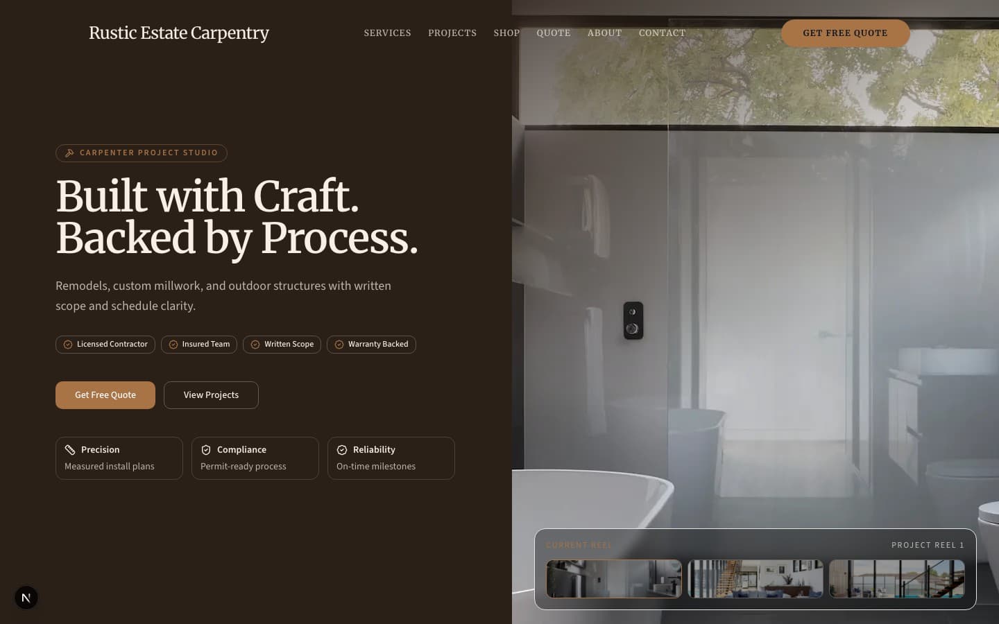
Rustic Estate
Warm rustic story-driven template for estate-scale outdoor + interior custom build showcases.
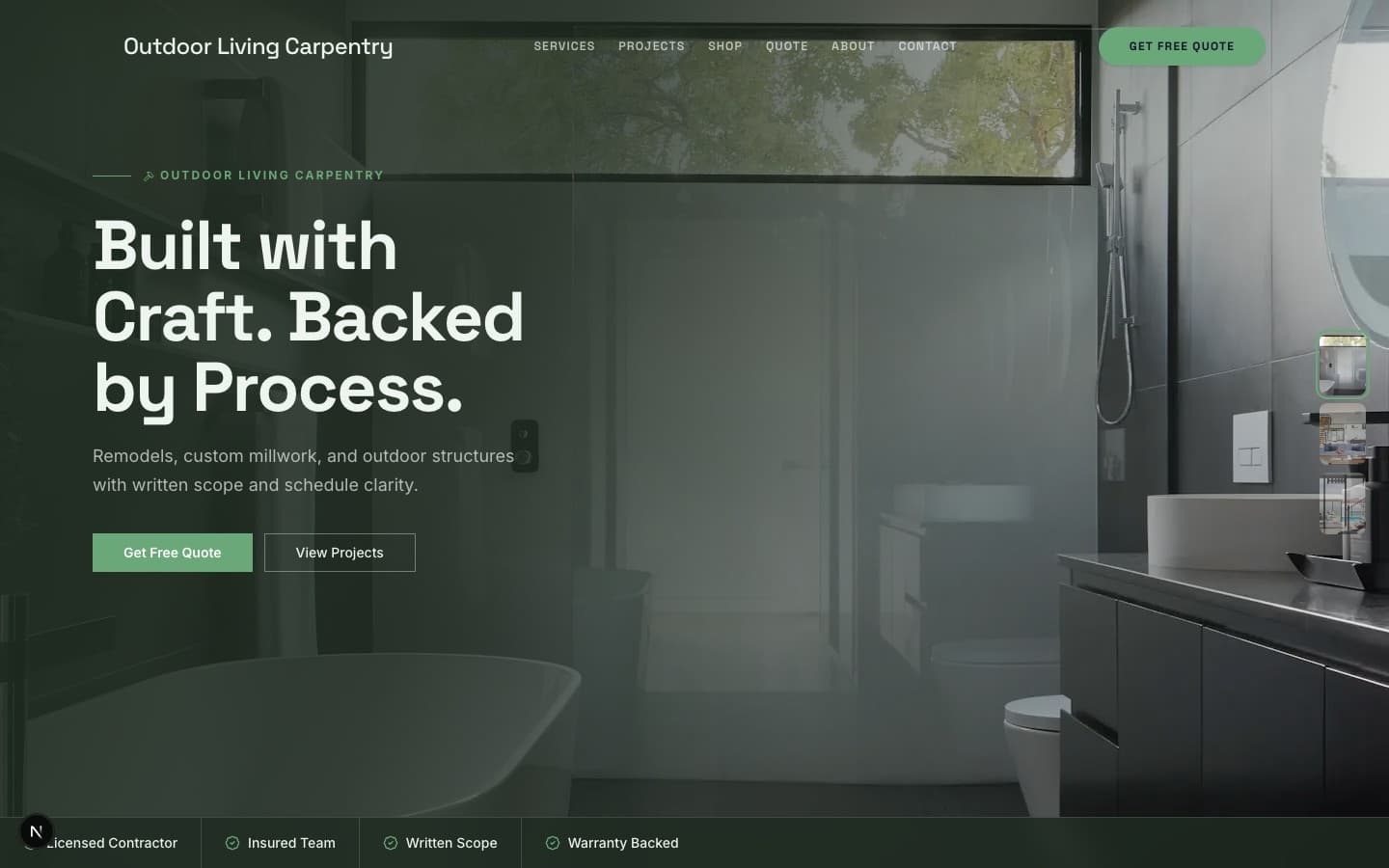
Outdoor Living
Outdoor-first conversion template with seasonal CTA framing, project reels, and service-area clarity.
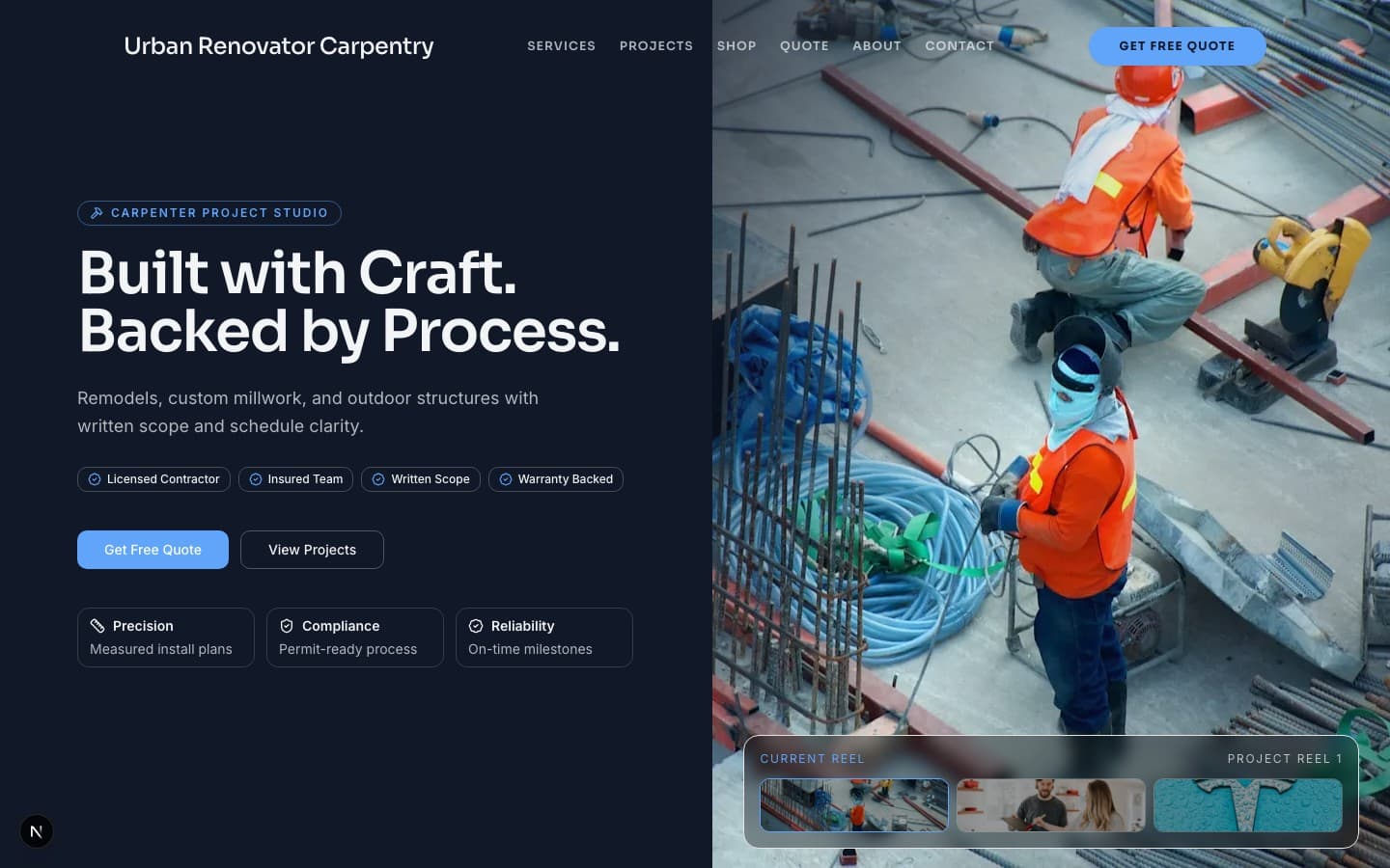
Urban Renovator
Urban modern split-reel hero and timeline-rich case studies tuned for city remodel momentum.
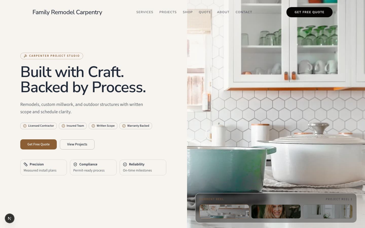
Family Remodel
Community and trust-forward family remodeling layout with transparent scope, costs, and local references.

Commercial Fitout
Enterprise credibility layout for light commercial fit-outs with certification and scope cards.
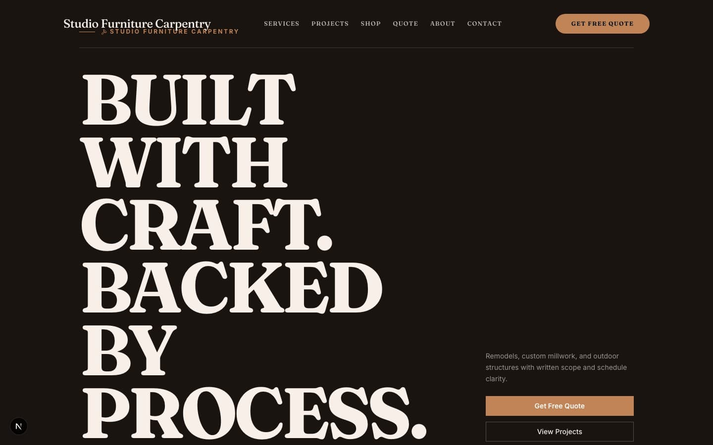
Studio Furniture
Catalog-heavy quote-cart experience for custom furniture studios with materials board and macro detail.
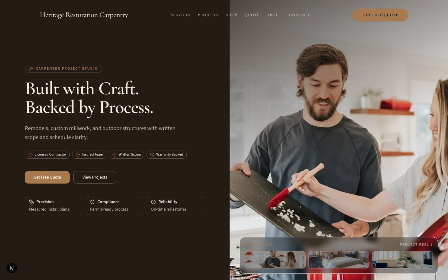
Heritage Restoration
Content-heavy restoration narrative with archival visual tone and long-form case studies.

The Obsidian Vault
Dark industrial luxury with deep blacks, fiery orange accents, and vault-like atmosphere. Positions bin stores as treasure-hunting destinations with premium weight behind every visual element. Best for established stores wanting to feel exclusive and high-value.

Neon Rush
Cyberpunk energy meets streetwear hype culture with electric neon green on pure black. Designed for stores that treat every bin drop like a sneaker release. The hype ticker and urgency-driven layout create FOMO that converts browsers into buyers.

The Blueprint
Technical precision meets data visualization with a dark navy blueprint aesthetic. Manifest previews and structured data grids give shoppers a strategic edge. Built for stores that attract methodical deal-hunters who plan their visits like operations.

The Golden Ticket
Editorial luxury meets treasure-hunting narrative with rich gold accents on deep warm black. Every find is positioned as a golden ticket moment. Serif typography and cinematic photography create an aspirational experience that elevates bin store shopping into an event.

The Daily Bleed
Newspaper-inspired white-on-white minimalism with bold red accents that create urgency without chaos. The price ladder layout mirrors daily markdown schedules with editorial clarity. Perfect for stores that want to feel fresh, modern, and information-forward.

The Industrialist
Raw warehouse aesthetic with exposed-grid layouts, yellow caution-tape accents, and condensed industrial typography. Celebrates the bin store for what it is: a working warehouse where deals are found through grit. No pretense, just authentic treasure-hunting energy.

The Treasure Map
Parchment-toned adventure theme that gamifies the bin store experience with map-style navigation, treasure iconography, and explorer typography. Turns every visit into a quest. The warm, inviting palette makes the treasure hunt feel accessible and fun for all ages.

After Dark
Mysterious deep purple void with secret-society vibes and members-only energy. Access gates and exclusive membership positioning transform the bin store into an underground club. Serif headlines and atmospheric photography create intrigue that makes shoppers feel like insiders.

Clean Slate
Scandinavian-inspired cream and sage palette that positions bin store shopping as sustainable, curated secondhand retail. Condition grids and quality-focused layouts shift the narrative from 'discount bins' to 'curated finds.' The calm, elevated aesthetic attracts sustainability-minded shoppers.

Hyper Market
Retro supermarket pop art with bold red sticker accents, rounded playful typography, and cream-to-yellow warm palette. Price stickers and inventory grids mimic supermarket flyer aesthetics. Fun, approachable, and unapologetically deals-focused for stores that celebrate the thrill of the bargain.
Ready to see yours?
Pick a template, share your brand — we handle the rest. Live in 24 hours, starting at $49/mo.